Are the Chicago Bulls still hanging onto the glory days of Michael Jordan?
Like many basketball and sports fans, on Monday night I watched the first two episodes of the Michael Jordan documentary, The Last Dance. I grew up in the 80’s and 90’s idolizing Jordan – for me he’s been the (male) defining force in world basketball (our own Lauren Jackson the female counterpart).
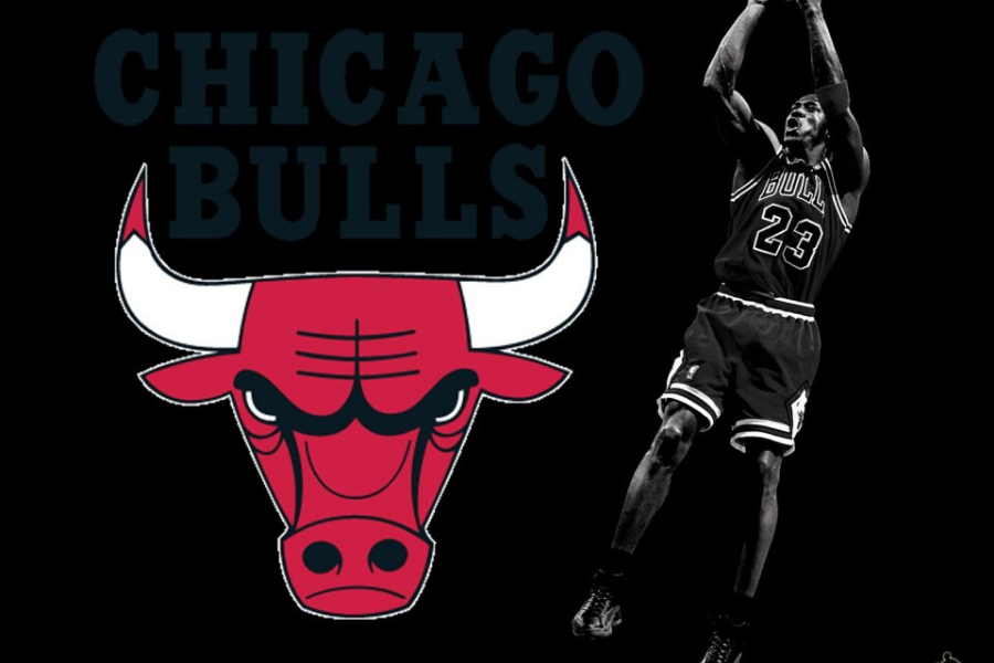
As I sat and watched old footage from the 80’s and 90’s something struck me about the Bulls – their logo hadn’t changed at all. I looked up the modern-day uniforms and it was still the same. Digging a little deeper I found out that the Chicago Bulls logo was developed in 1966 and had not been updated since! It shows. While it’s instantly recognisble, the graphics, wordmark and font are incredibly dated.
So why hasn’t it been updated? Was the Jordan era so defining for the Club, and remains so relevant even today, that they’re unwilling to make any change? And if so, is it powerful enough to continue to move through generation after generation?
Now, I don’t know the answers to those questions, but why it sparked my interest was that at the Deakin Melbourne Boomers we’re currently working on a brand refresh leading into our WNBL 20-21 Season.
Our existing branding was outdated in style, and with the evolution of the organization, we felt it was the right time to update to something that better represents who we are and was more closely aligned with our core values. Further to this, with the impact of COVID-19, it presents an opportunity to come out of this strongly, and with new energy.
While the Bulls may be digging their heels in, all other NBA teams have had brand refreshes at some point in time, some with slight variations, others with dramatic changes.

Closer to home you only have to look at the football codes in Australia who continue to evolve their brands to ensure they remain current.


In the WNBL the University of Canberra Capitals, current league champions, have refreshed on occasion, their most recent just 18-months ago which, in my opinion, revolutionized their brand and challenged the rest of the teams in the league to catch them. In a league that’s striving to evolve and grow, these sorts of bold moves are required.

Outside of sport, even the most iconic brands update occasionally. The evolution of Microsoft from 1975 to now paints a clear picture of why it’s important to be relevant to the time you’re in.

So back to the Bulls – should they refresh? Or has the Jordan phenomenon locked them in so tightly that they feel they can’t move? Only time will tell.
But the truth is, no logo can stay relevant forever. Times change, and with that, brands must evolve.
Personally, I can’t wait to share the new Boomers branding far and wide. We’ll have a new logo, new colour palette, new font and new image guidelines. It’s going to be fresh and exciting. It’s going to help drive us out of COVID-19 into a new era. Look out Caps, here we come.